Role
UX Researcher
UX Designer
UI Designer
Applications
Sketch
Invision
Adobe Creative Cloud
Duration
90 Hours
Problem
Arc Bicycles is a high-end bike retailer whose main outreach is through a mobile-web experience. Data shows that 50% of shoppers open seven item pages on average, and then abandon the site without moving any items into the cart. Additionally, 70% of shoppers who place an item in the cart do not purchase. Customers are abandoning the cart at the registration page. Currently users must create an account in order to make a purchase.
Based on this data it is apparent that enhancements should be made to the existing mobile-web experience in order to improve the shopper’s experience while browsing bicycles and also at the point of purchase. My hypothesis is that users are unable to determine which bike is best based on relative features while browsing. They are also unwilling to create an account to make a purchase.
User Interviews
“As an experienced biker I am looking for what new products can do for me when I’m out on the road. Are there better or more robust features?”
“I like to see all of the features and details of the bike I’m looking at, but sometimes it can be hard to read through.”
“I have too many accounts. I always try to avoid making more.”
“I like backcountry because the feature details show exactly what parts are used in the bike.”
The majority of users on the website are men (72%) and between the ages of 24-38. They are high income earners who see their next bike as an investment. They are willing to spend up on the purchase, but with that comes in-depth research to determine which bicycle best fits their requirements.
I conducted screener surveys to find five individuals who fit this demographic and were willing to discuss their thoughts in an interview. The survey outreach took place on social media platforms, and word of mouth through local bicycle stores.
Persona
Arc’s customers are savvy, focused, serious, and dependable. They not only want the best bike that fits their needs and riding style, but they also want to know what makes it the best bike for them. They will comb through details to ensure their next bike investment is perfect.
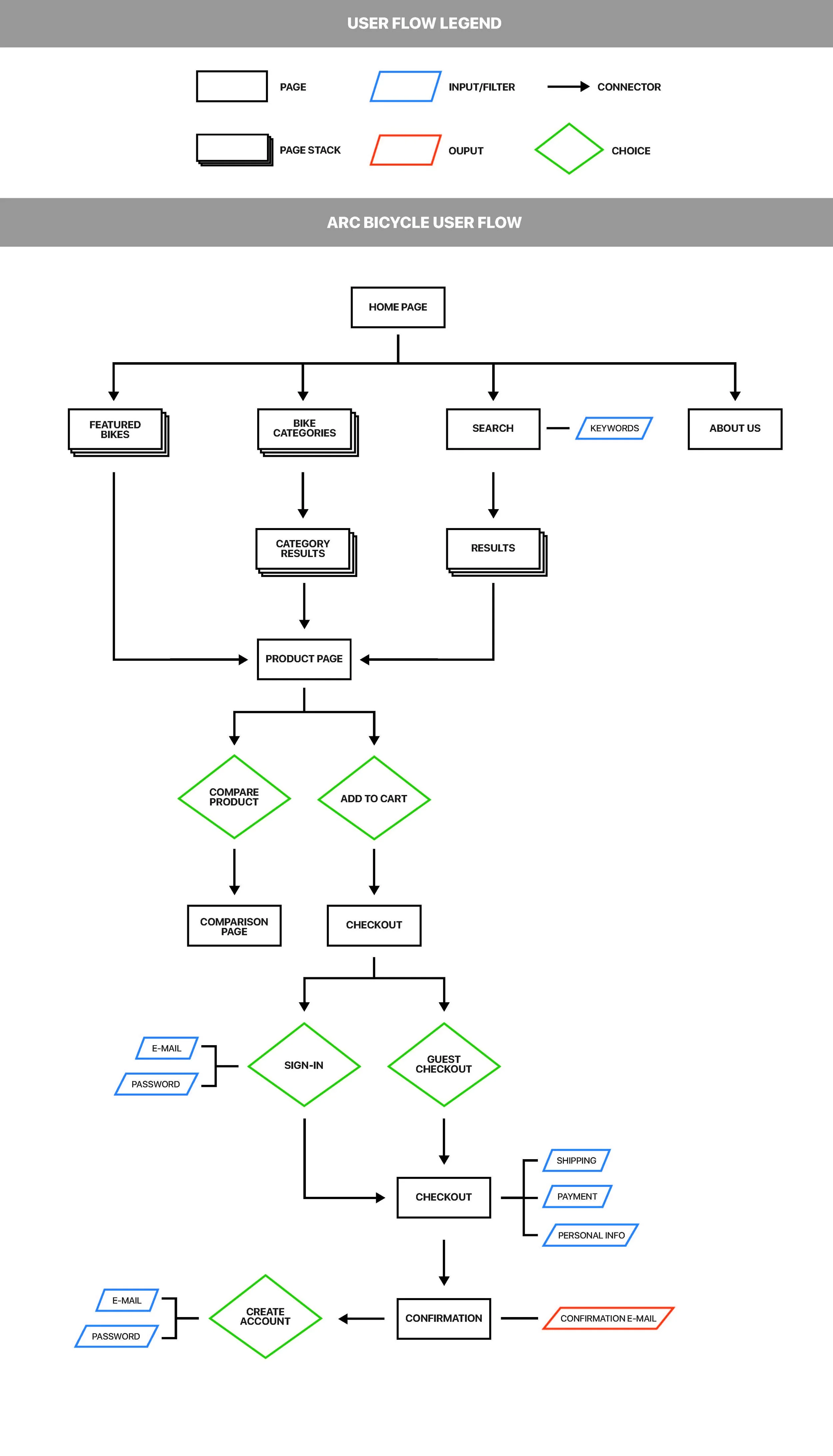
Because of this trait a type of comparison tool would be fitting to allow them to see detailed aspects between bicycles without the hassle of opening multiple browser tabs and flipping between listings. This tool would be an intuitive and quick way to see differences between bikes, choose the best fit, and move on to compare to another or make a purchase.
User Flow
Low-Fidelity Prototype Testing
Several individuals were asked to complete several tasks using the low-fidelity prototype such as finding bicycles, comparing them to others, and making a purchase. Each participant completed all tasks, but after the test several issues became apparent in the current design.
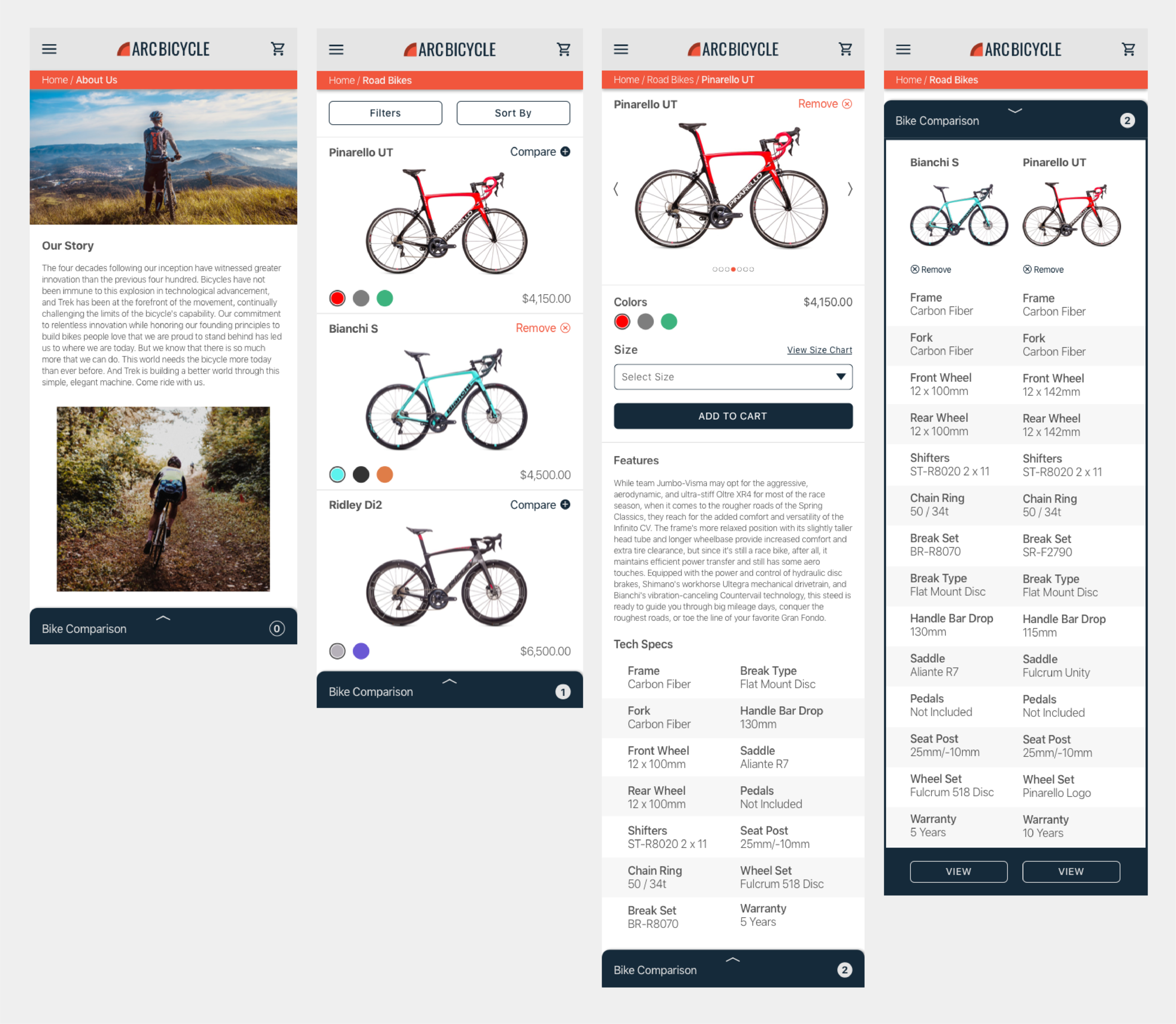
Users did not easily identify the compare button on the bicycle product pages. The compare button here is a secondary button that may have resembled a form field. While on the list results page the compare buttons were more easily recognized, but the button is visually different from the one located on the product page. Moving forward it will be key to make these buttons consistent in their shape, color, and screen position.
The back button area did not include a breadcrumb trail initially due to the limited amount of pages, however this proved to be troublesome to shoppers when interacting with the product comparison tool. The idea of this tool is to be treated as a light-box that is always accessible and will lay over the current page when used. This made users question where they would be directed when navigating back. Adding a breadcrumb trail should improve this issue, but it will also be important to improve the way the user interacts with the comparison tool to more clearly show it is an overlay.
For what it’s worth, all participants also preferred to check out as a guest and most voiced they would consider purchasing elsewhere if account creation was necessary.
Style Guide
High-Fidelity Prototype
The final Arc Bicycle concept provides high-end brand appeal through simple and clean layouts. A brand story page at the fore-front invites customers to read their story and provides credibility to the retailer. Large images of the products creates a sense of transparency with shoppers and further justifies high price tags. Bikes can quickly be compared by adding them to the bike comparison tool straight from the results list page. This allows customers to easily see features between bicycles to determine which would be best for their needs. It is more intuitive than saving bikes to a list or cart and accessing each product page individually.
To prevent customers from rebounding at the start of the checkout process a guest check out option was created. This simple change makes the site more welcoming to all visitors, and should increase the amount of purchases made. The guest checkout process still captures the shoppers e-mail for order communication. All of the necessary information to make an account is filled out during the checkout process (besides creating a password) so the customer is welcomed to create an account at the end of the process. This could lead to more future business for the retailer, but also does not feel intrusive to the user.
During future stages I would like to focus on the account creation flow at the end of the purchase. It would be great to gather data on how many customers transition to making an account, and think about ways to improve conversion.


